 Paper Stickers
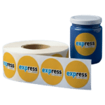 Vinyl Stickers
 Special Stickers
Whether you are branding a new product line or creating labels for a special event, the vibrancy and accuracy of your colours are vital. Precise colour representation ensures your brand looks professional, consistent, and high-end.
Poorly managed colours often result in dull, washed-out, or mismatched shades that can undermine your brand’s message. According to design experts, colour is the primary factor in how customers interpret a brand’s personality and make purchasing decisions.
To ensure your next batch of Express Stickers turns out exactly as you envisioned, follow this essential guide to colour management.
Understand RGB vs. CMYK
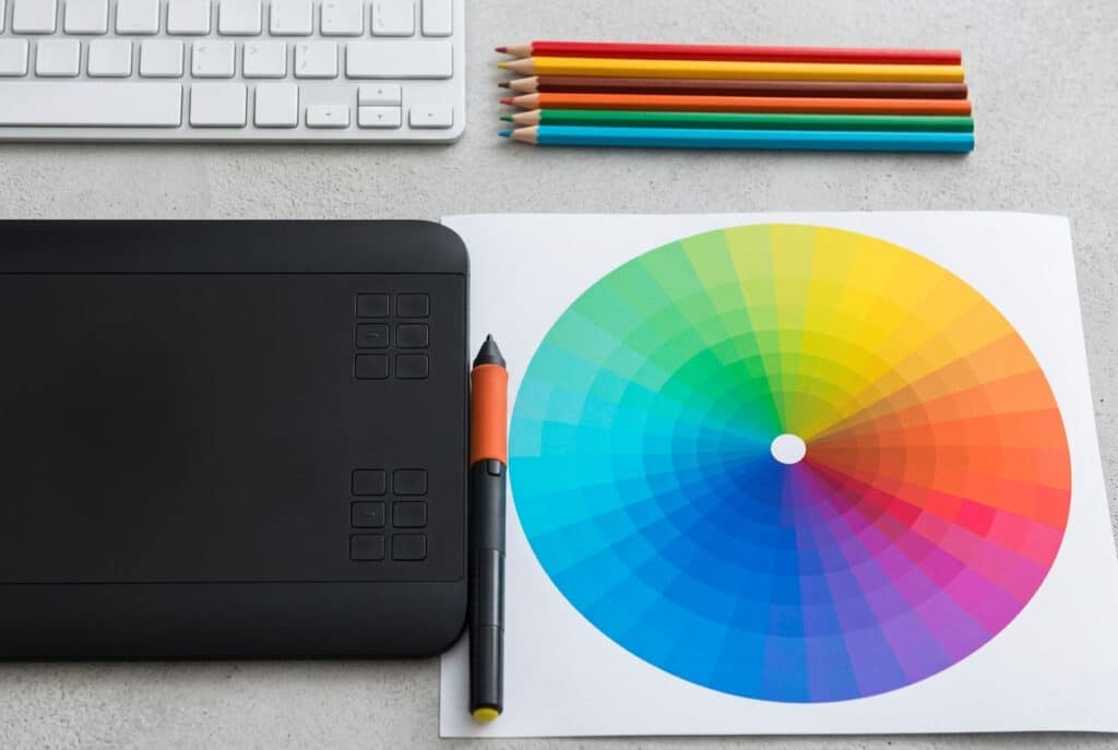
The most common mistake in printing is using the wrong colour mode. Designers often work in RGB, but printers live in a CMYK world.
- RGB (Red, Green, Blue): This is for digital screens. Monitors and smartphones use light to create colours. Because it relies on light, RGB can display “neon” or “electric” shades that physical ink simply cannot replicate.
- CMYK (Cyan, Magenta, Yellow, Key/Black): This is the standard for professional printing. Printers layer these four inks to create a full spectrum of shades.
Action Tip: Always set your design software to CMYK mode from the start. If you’ve already designed in RGB, convert it to CMYK and manually adjust any shifts in vibrancy before sending it to the press.
Calibrate Your Screen

The colours on your monitor might be lying to you. If your screen brightness is set to 100%, your design will look much brighter than it will appear when printed on a physical material.
- Adjust Brightness: Lower your monitor brightness to roughly 50% when proofing designs to get a more realistic preview.
- Calibration Tools: Use software or hardware calibration tools to ensure your screen’s “Red” is the same “Red” the printer sees.
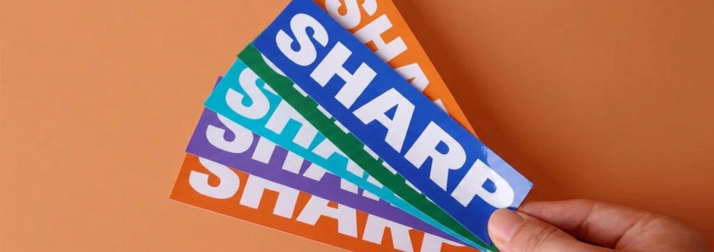
Choose the Right Material Finish

The material you choose whether it’s for Bumper Stickers or Product Labels drastically changes how ink is absorbed and reflected.
- Glossy Finish: Makes colours “pop” and appear more saturated. Best for high-contrast designs.
- Matte Finish: Provides a sophisticated, non-reflective look. It can slightly mute colours, making them appear softer and more “premium.”
- Vinyl vs. Paper: Vinyl Stickers are highly recommended for colour longevity. They are UV-resistant and waterproof, meaning your colours won’t fade or bleed when exposed to the elements.
Use High-Resolution Vector Files
A blurry design can make even the most accurate colour look “off.” For the sharpest results, avoid pixelation at all costs.
- Vectors (PDF, EPS, AI): These files use mathematical paths instead of pixels. You can scale a vector from a tiny Die Cut Sticker to a massive wall decal without losing any clarity or colour integrity.
- The 300 DPI Rule: If you must use raster images (like JPG or PNG), ensure they are at least 300 DPI at the actual size you want them printed.
Partner with a Professional Printing Service

While home printing is convenient, it rarely offers the consistency required for branding. Professional shops use industrial-grade equipment and premium inks that guarantee colour consistency across thousands of units.
Final Thoughts
Achieving the perfect shade doesn’t have to be a guessing game. By starting with a CMYK vector file and choosing the right Express Stickers material, you ensure your brand stands out with professional, vibrant, and accurate results every time.